January 23, 2007
ibm launches many eyes
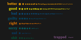
Many-Eyes is a site for massively collaborative visual data analysis, allowing users to upload data sets, visualize them, and discuss them online. In this sense, it is similar to other projects like Swivel and Data360, but supports a much broader range of data types and engaging visualizations. And it's a lot of fun to play with!
I had the privilege of working this past summer at IBM Research Cambridge in the Visual Communication group with Martin Wattenberg and Fernanda Viégas. Having watched them and the rest of the team prepare this project, it's exhilarating to see it launched! We also spent time researching and testing additional features to support social data analysis. Look for our upcoming CHI2007 paper (link soon) for more!
September 29, 2006
science visualization challenge
Here are the winners of the 2006 Science Visualization challenge. There is some really beautiful work here. There's also a slide show.
June 03, 2006
mini-interview
A short interview about my experiences and thoughts on information visualization was recently posted on the blog mentegrafica. The text of the mini-interview is included in the extended entry.
Continue reading "mini-interview"May 25, 2006
justice
speaking of feeling fine, skilling and lay found guilty of fraud, conspiracy, and a bit of insider trading.
May 23, 2006
feeling fine
"Do Europeans feel sad more often than Americans? Do women feel fat more often than men? Does rainy weather affect how we feel?"

The net-art project We Feel Fine attempts to answer some of these questions through a set of playful yet ambitious visualizations backed by data scraped from thousands of blogs.
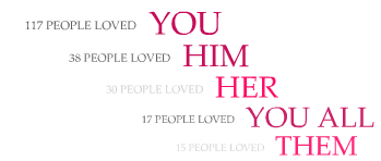
For those of a more dichotomous temperament, the same data stream is used to power Lovelines, an interactive exploration of statements of love, hate, and everything in between.
The projects were created by my friend Sep Kamvar and his collaborator Jonathan Harris (also responsible for the Webby-winning 10x10 and WordCount visualizations). Should you have any related ideas of your own, the two have made the results of their continual blog-crawling available to all in the form of a public web API.
April 20, 2006
vizster on tv
The Vizster social network visualization by danah boyd and I was used on the CBS crime drama Numb3rs! In the March 3 episode "Protest", the software was used to help illustrate the concept of social networks. Check out the clip:
September 29, 2005
bernal burning
Bernal Heights Park in San Francisco caught on fire tonight, up at the top of the hill, two blocks above my apartment. We worriedly watched it spread, as winds blew it steadily to the east. Fire crews arrived on the scene and went to work on the blaze with both the hose and the pick axe. At one point, a firefighter perched on a steep part of the hill slipped, falling towards the fire while his hose sprayed around out of control. Fortunately, he caught himself, tackled his wayward hose and went back to work. Overall, they made quick work of putting it out, saving the rest of the park (as well as our homes).
I have camera phone photos of the blaze both before and after. I don't know if the cause has been determined. I'll have to check the papers tomorrow...
June 18, 2005
terraforming
This is old news, but I need to save some pointers here. Whether you desire a few palm trees or the entire world, Dubai's working on it.

June 15, 2005
jobs talk
In most arenas, I'll take Cal over Stanford any day. However, I have noticed that Stanford sometimes scores a decent commencement speaker. Minus one style point each for (a) the Horatio Alger rehash and (b) the "oh poor billionaire" pity ploy, but plus ten points for implicitly telling a crowd of exiting stanfordites they may have just wasted fours years of their life and thousands of dollars.
June 11, 2005
those unsightly seams
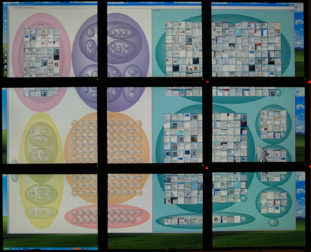
Using multiple monitors on your desktop is great, and studies have shown it works especially well when different tasks/tools break up cleanly amongst the different screens (e.g., excel and e-mail, coding and documentation). It doesn't quite work as well when trying to expand a single window over all the monitors, because the seams between monitors chop up the space and introduce discontinuities.
This brief ZDNet article mentions some of the wonderful large display work at microsoft research, but the article of course neglects to mention the issue of seams. With multiple monitors, lines/curves become discontinuous, and what should be single elements get chopped up into pieces. This wreaks a bit of havoc with gestalt perception and in my opinion decreases the aesthetic experience of the interface.

What are the solutions? Large displays without seams is one (and microsoft and others are already working on this). For today's consumers, a reasonable stop-gap may be to make interfaces seam-aware, allowing layout and presentation of interfaces to take seams into account (e.g., excel spreadsheet cells could automatically realign to improve readability across monitors). Jock Mackinlay and I devised one approach to building seam-awareness into interfaces, though things being what they are, I don't expect to see it on desktops anytime soon :)


