 |
|
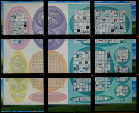
June 11, 2005those unsightly seamsUsing multiple monitors on your desktop is great, and studies have shown it works especially well when different tasks/tools break up cleanly amongst the different screens (e.g., excel and e-mail, coding and documentation). It doesn't quite work as well when trying to expand a single window over all the monitors, because the seams between monitors chop up the space and introduce discontinuities. This brief ZDNet article mentions some of the wonderful large display work at microsoft research, but the article of course neglects to mention the issue of seams. With multiple monitors, lines/curves become discontinuous, and what should be single elements get chopped up into pieces. This wreaks a bit of havoc with gestalt perception and in my opinion decreases the aesthetic experience of the interface.
What are the solutions? Large displays without seams is one (and microsoft and others are already working on this). For today's consumers, a reasonable stop-gap may be to make interfaces seam-aware, allowing layout and presentation of interfaces to take seams into account (e.g., excel spreadsheet cells could automatically realign to improve readability across monitors). Jock Mackinlay and I devised one approach to building seam-awareness into interfaces, though things being what they are, I don't expect to see it on desktops anytime soon :) Posted by jheer at June 11, 2005 12:24 PMComments
Trackback Pings
Trackback URL
|
| jheer@acm.ørg |
