 |
|
February 21, 2005web graffiti and greasemonkeyI had recently been thinking about the need for "web graffiti" - ways to either enhance or deface (depending on your perspective) various web sites... whether changing visual design elements, logos, appropriately replacing targeted pieces of text, redirecting links, or maybe just removing all the extraneous clutter sites throw at you. Maybe something along the lines of letting Adbusters loose on the web. The thought was tending in the direction of a browser plug-in that for whatever site you were visiting could retrieve the currently available "defacements" and allow you to apply them to the site at hand, dynamically changing the stylesheet, rewriting page elements, and what have you. Turns out this is already much much further along than my myopic grad-student awareness had realized. Ryan has a fascinating post about Greasemonkey, a firefox plug-in for injecting custom scripts into any webpage, enabling you to change their design or functionality. Examples include changing any URL-like text into a link, removing Google AdWords, and clearing out other advertising and design clutter. Ryan also offers some spot-on points about the ramifications this could have for businesses and the ensuing arms-race. So I still want the sidebar that will allow me to discover new scripts and "defacements" in situ as I browse around. Coupled, of course, with some mechanism to avoid the malicious scripts that will wreak unwanted havoc upon me. Add to that a visual interface for interacting with and editing a web page's structure--e.g., HTML/DOM elements, stylesheet definitions, etc--and exporting edits to a script... and then supporting derivative works, thereby enabling "defacement dialogues"... the list goes on... there's much fun to be had on the re-appropriated web.
Posted by jheer at 06:16 PM
| Comments (1)
February 14, 2005large social network vizHere's a first pass at some large-scale social network visualization. The layout needs some work, and there's plenty more attributes to explore, etc, etc, but I figured these images might be interesting enough to share now...
Posted by jheer at 01:57 PM
| Comments (1)
February 11, 2005namespaceEven if you're not expecting, you should check out the Baby Name Visualizer.
Posted by jheer at 11:39 AM
| Comments (1)
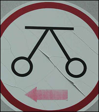
February 07, 2005semiotic sillinessi recall the sign on the right providing loads of fun in montreal.
Posted by jheer at 06:13 PM
| Comments (1)
February 02, 2005visual lies and refreshed eyesAwaiting my train home last night, I was taken in by the BART map, a visual staple from my daily routine. Typically invisible, its absence would mean more to me than its presence. But due to some random set of neuronal circumstances, I found myself taken aback, recalling the experience of my teenage years, when this map signified so much more. As teenagers newly liberated with driver's licenses, we would escape the clutches of hometown Stockton, CA and drive west, stopping at the BART station to continue our trek into the city - a city known in name but not in experience. Multi-colored tendrils reaching out of the nexus of Oakland, a rainbow streaming into the heart of San Francisco (appropriate, no?)... they represented more than just the train lines we would ride. They signified freedom, exploration, and overall, a foreign sense of urbanality - the big city, punks, hippies, drugs, clubs, skyscrapers, high-rises, yuppies, money, power, and connections to both the world at large and the myriad worlds within its borders. In short, cultures foreign and enticing to us newly mobile inhabitants of the central valley.
Being a current resident of San Francisco, those connotations are often lost, urbanality reduced to plain banality. I've escaped this habituation at times by stepping into new cities with their unmistakable maps - the geography-bending presentation of the London Underground, the Paris Metro, the Berlin U-Bahn, all decipherable, yet with conventions and topologies different enough to re-instill that sense of wonder. But last night I had that same sense, standing here in the familiar world of Bay Area Rapid Transit. What is it (barring psycho-pharmaceuticals) that allows one to suddenly see the familiar with refreshed eyes? By simply manipulating its conventional signs, to what degree can one transform experiences of BART, and of the Bay Area as a whole? As I fall down the rabbit hole in search of a ph.d topic, I find myself continually coming back to these notions of visual literacy, authorship, and the interplay brought on by the inherent sociality of shared representation. Visual representations, no matter how iconic, still must be interpreted; they must be read like a text. It is communication, not only between designer and viewer, but among all within its sphere. Our cultural upbringing favors particular signs over others, discourse giving birth to a false sense of naturality. We can (and advertisements routinely do) exploit these systems to motivate, evoke cultural affiliations, and in doing so, even lie outright. Beneath it all, what can we do to open these representations up to re-appropriation, especially as they become more commonly codified in digital media? To create visual-interactive dialogues and evolved languages, with various flows and sub-cultural eddies? I am currently lost somewhere in between de Saussure, Barthes, Foucault, Goffman, Gibson, Palmer, Merleau-Ponty, Heidegger, Tufte, Card, Mackinlay, and Shneiderman. And god knows what I'm still missing. Seems like a lot to be sorting out, but it does look pretty fun---culture jamming brought on by teenage nostalgia.
Posted by jheer at 11:08 AM
| Comments (2)
|
| jheer@acm.ørg |


